
Rebranding and signage design created for a Kashubian recreational resort.
The resort has been opened in 1984 and initially served as a restaurant called „u zbója”, which can be loosely translated as „at the scoundrels”.
Over time it has transformed to a recreational resort, offering a mix of recreation and regeneration, where one of the key benefits is the possibility to spend your vacations under the care of doctors and other specialist qualified in the areas of health and beauty. It’s also the first resort in Poland to obtain the dr Ewa Dąbrowska’s diet certificate, aimed to guarantee the authenticity and effectiveness of the various programs offered.
Rebranding and signage design created for a Kashubian recreational resort.
The resort has been opened in 1984 and initially served as a restaurant called „u zbója”, which can be loosely translated as „at the scoundrels”. Over time it has transformed to a recreational resort, offering a mix of recreation and regeneration, where one of the key benefits is the possibility to spend your vacations under the care of doctors and other specialist qualified in the areas of health and beauty. It’s also the first resort in Poland to obtain the dr Ewa Dąbrowska’s diet certificate, aimed to guarantee the authenticity and effectiveness of the various programs offered.
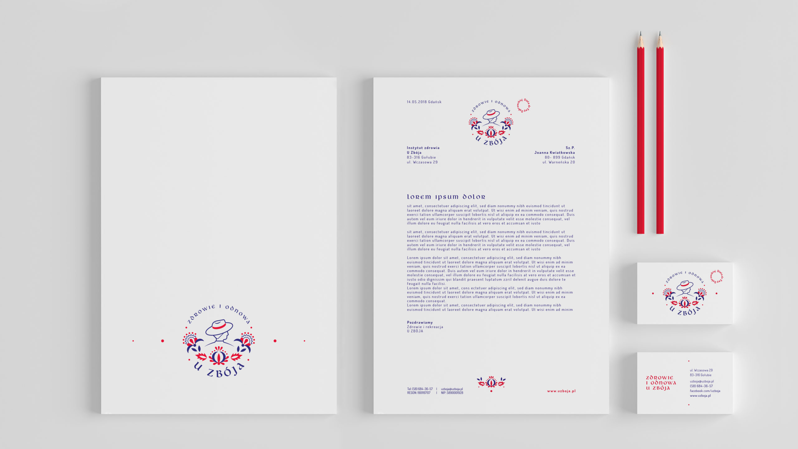
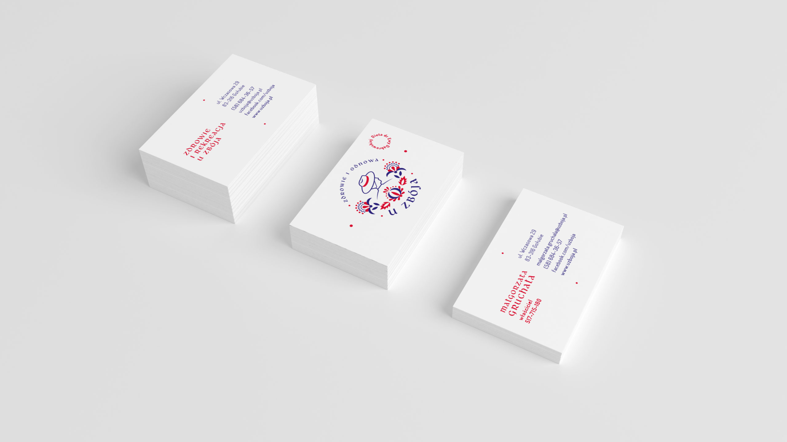
Despite many changes that have occurred in the resort since 1984, the owners remain strongly connected to it’s heritage and original name. Still – they desired for the branding to be refreshed and get rid of the previous logotype, that displayed a scruffy scoundrel holding a plate with food. Considering that, the logotype has been designed with the intention to showcase the sounder as a positive hero, more resembling characters like Robin Hood – athletic, mysterious and in love for his small Kashubian homelands.
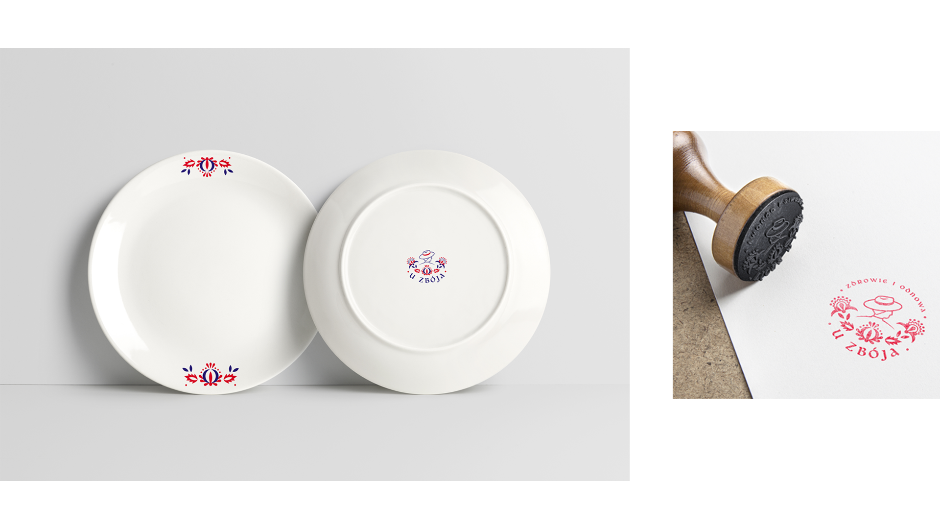
The emblem has been design to represent these ideas – the scoundrels silhouette is presented in a traditional Kashubian hat and supported with ornaments thad draw from Kashubian embroidery. All of this is embedded in a circle created by the resort name and tagline, designed to resemble an old wax seal.

Basic Logo variant
In the basic variant the logo forms a circle with the name and tagline of the resort (that could be translated as „health and regeneration”) inscribed within it.
Alternative Logo variant
The alternative version of the logo consists of an emblem and the resort name logotype below it. It has been designed for usage in mobile environments or other places where there is only a small surface display it.

Basic font
„LibraEU” is the primary font used in the logotype, as well as for highlights in the other visuals.
Complementary font
„Dosis font family” is the complementary font in the identity design, marking and page in the abov ementionedv

Primary colors
The primary colours of the design, inspired by traditional Kashubian garment, are the only two colours of the design that coexist in the logotype and are dominating in the branding and resort signage/labelling.
Complementary colors
The four additional colours used in the design draw from the ones typically used in Kashubian embroidery. They compliment the design and can be used also in uniform colour logo variations.

Restort map
Based on the visual identity designed, a center mark was created, as well as information boards, maps, and signposts.

Internal signage

External signage for buildings

to see more visits
uzboja.pl
